Logo Redesign
Peet Roofing sought to refresh its logo while maintaining its familiar look and feel. To accomplish this, subtle changes were made. The color was updated to a lighter shade of red, providing a fresh and modern aesthetic. Additionally, the outline was lightened, adding a touch of elegance. The most notable alteration was the repositioning of the roof graphic, placing it on the whole "Peet" portion of the logo, further emphasizing their roofing expertise. The result was a refreshed logo that retained brand recognition while infusing a sense of renewed energy and clarity.
BEFORE/AFTER

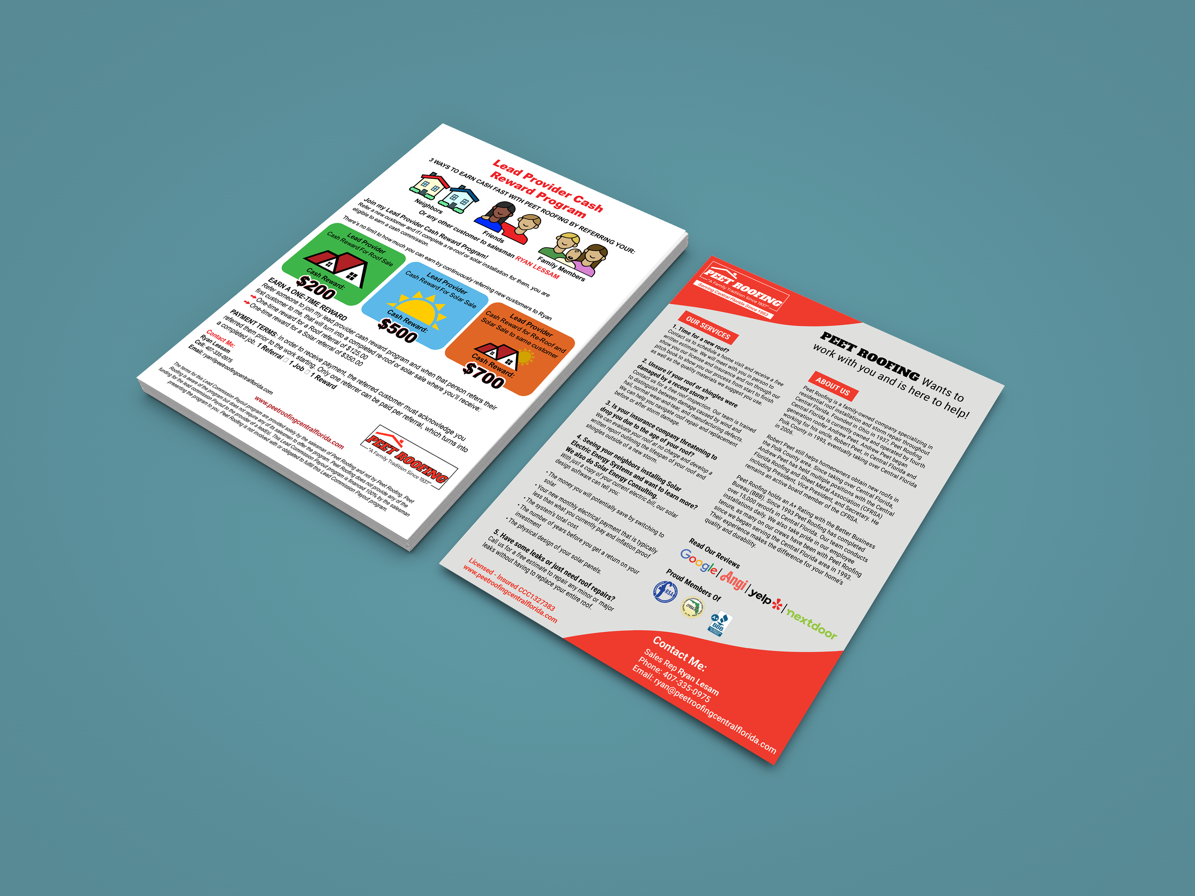
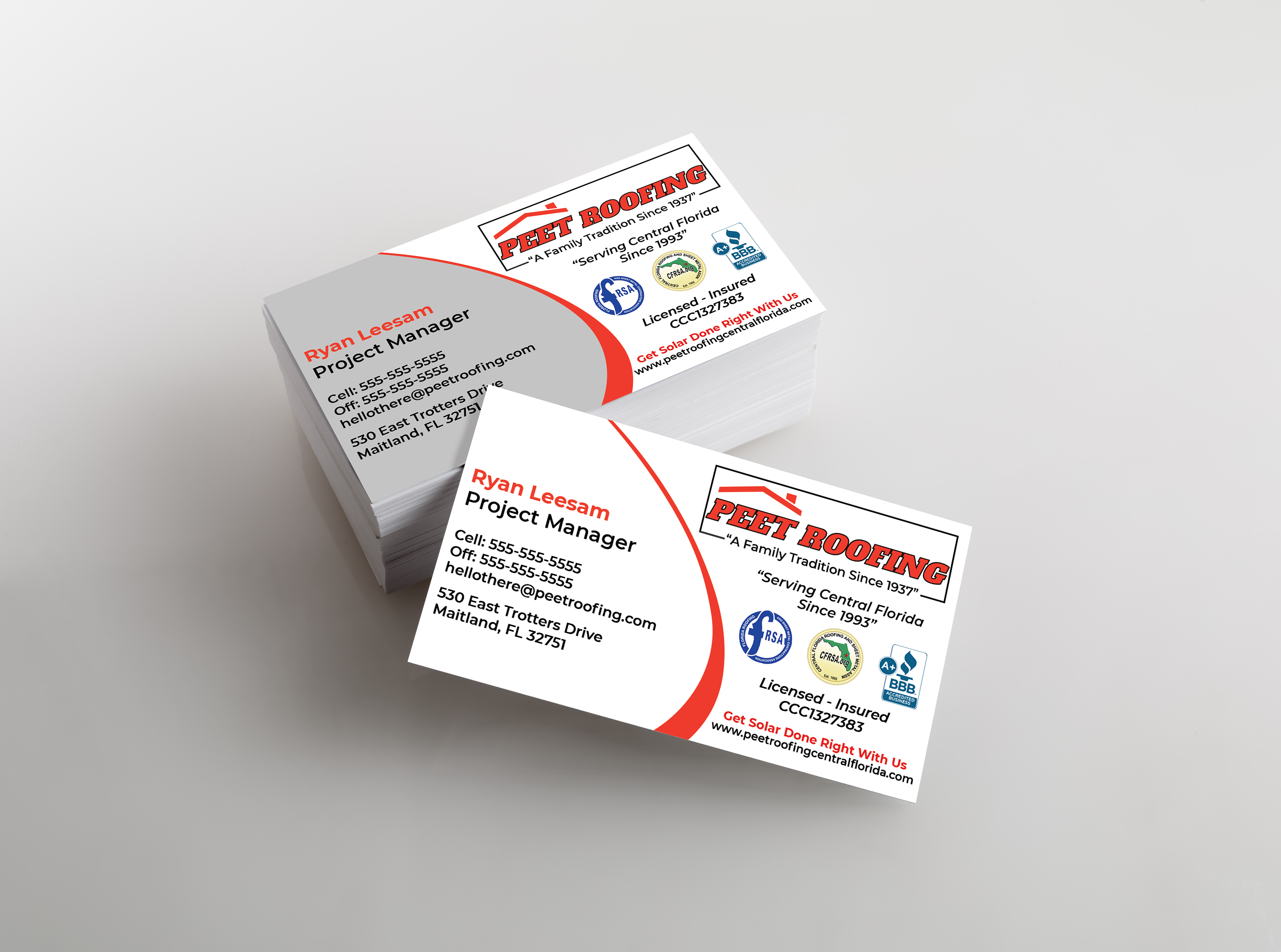
Print Materials (Sell Sheets & Business Cards)
Building upon the refreshed logo for Peet Roofing, a comprehensive brand identity was developed to ensure consistency across all touchpoints. This included defining the typography, color palette, and visual style that aligned with their new logo. The brand identity was seamlessly integrated into various print materials such as business cards and sell sheets, creating a cohesive and professional look that reinforced Peet Roofing's brand image and effectively communicated their services to clients.